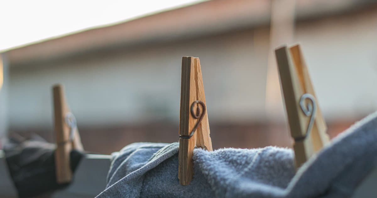
Walk into almost any large grocery store and you will find the same layout, because it works. The flowers and fresh produce greet you at the entrance, the milk and eggs sit at the very back, and the candy waits at the register. None of this is an accident. Supermarkets are some of the most carefully studied retail spaces in the world, and the path you take through one has been shaped over decades to keep you inside longer and send you home with more than you came for. Once you see the design, you cannot unsee it, and that is the first step to spending the way you actually intend to.
Consider the entrance. The produce section and the fresh flowers are placed first on purpose, because they hit your senses with color and freshness the moment you arrive. That positive first impression makes you feel good about the store and a little looser with your choices for the rest of the trip. It also plants a sense of healthy intention, which research suggests makes shoppers more comfortable rewarding themselves with less healthy items later. You start in the garden, you feel virtuous, and you carry that feeling toward the aisles where the real margins live. The store has set the mood before you have picked up a single item.
The placement of staples is the clearest trick of all. The things nearly everyone comes for, milk, eggs, bread, are pushed to the far corners and the back wall. The reason is plain once you say it out loud. To grab a gallon of milk, you have to walk past hundreds of other products, and every one of them gets a chance to catch your eye. The longer the path to the essentials, the more impulse purchases land in the cart along the way. A store that put the milk by the door would be leaving money on the table, so it never does. Your most predictable needs are used as bait to march you past everything else.
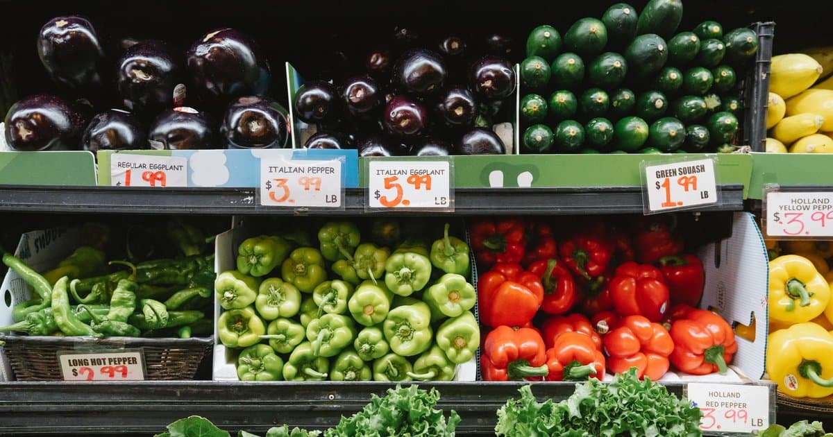
Then there are the shelves themselves, which are mapped down to the inch. The most profitable items, the name brands paying for placement, sit at eye level where your gaze naturally lands. The cheaper store brands get pushed high or low, where you have to reach or crouch to find them. Products aimed at children are set lower on purpose, at a kid's eye level, so they can spot the cereal with the cartoon on it and start the conversation you did not want to have. The end of each aisle, the endcap, is prime territory, and the deal displayed there is often not much of a deal at all. It is simply placed where you cannot miss it.
The checkout is the final and most cynical stop. After a long walk and a full cart, your willpower is worn down, and that is exactly when you are funneled past racks of candy, gum, magazines, and small grabbable extras. This is the impulse zone, designed for the tired, slightly decision fatigued version of you that exists at the end of a shopping trip. The items are small, cheap, and easy to justify, which is precisely why they add up across millions of carts. By the time you are unloading onto the belt, the store has had one last quiet pass at your wallet.
The design goes deeper than placement, down to the pace you move and the music you hear. Many stores play slower songs on purpose, because a relaxed shopper lingers, and a lingering shopper buys more. The aisles are often wide enough to slow your cart and tempt you to browse rather than march straight through. Free samples are not just kindness, they are an invitation to stop, taste, and feel a small sense of obligation to buy. Even the lack of windows and clocks in many large stores is deliberate, because a shopper who loses track of time stays longer than one watching the afternoon slip away. Every one of these touches is small on its own, and together they add up to a space engineered to keep you comfortable, unhurried, and spending.
None of this means the supermarket is the enemy, and none of it requires you to shop angry. It just rewards a few simple habits. Make a list and hold to it, eat before you go so the displays have less pull, and check the high and low shelves where the cheaper options hide. Be a little suspicious of the endcap and the candy at the register. The design is not going anywhere, because it works on people who do not know it is there. The fix is not fighting the store. It is walking in already knowing the game it is playing.