Once a month, a single number lands in the news and shapes how people feel about the economy. It is the unemployment rate, and when it ticks up or down, headlines and markets move with it. What most coverage does not explain is that the rate everyone quotes is one of several the government actually publishes. The familiar figure is known as U-3, and it has a narrow definition of who counts as unemployed. There is a broader measure, called U-6, that captures more of what people experience on the ground. The gap between the two is where a lot of real hardship lives.
To understand the difference, it helps to know how the headline number is built. The figures come from a monthly survey of households, not a count of every worker. To be counted as unemployed in the U-3 measure, a person has to be without a job, available to work, and actively looking for one in the past four weeks. That last part matters more than it sounds. If someone has given up looking because they do not believe jobs are out there, they fall out of the count entirely. On paper, a discouraged worker who stops searching can make the unemployment rate look better, even though their situation got worse.
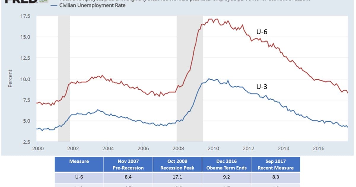
The broader U-6 measure tries to fix that blind spot. It still includes everyone in the headline number, then adds two groups the narrow figure leaves out. The first is people who want a job and have looked recently but not in the last four weeks, often called marginally attached or discouraged workers. The second is people working part time who want full time hours but cannot find them. Adding those groups regularly produces a rate several points higher than the headline figure. That spread is a rough measure of how much hidden slack the simple number misses.
Who is affected by the gap is not random, and the data has shown clear patterns for a long time. Unemployment has consistently fallen harder on Black workers, whose jobless rate has tended to run close to double the rate for white workers across good times and bad. Younger workers, those without a college degree, and people in regions with fewer industries also tend to sit on the wrong side of the gap. Underemployment hits the same groups, since part time work that does not pay the bills is not the same as being employed in any meaningful sense. When the headline rate looks healthy, these communities can still be carrying real strain that the top number does not show.
For everyday people trying to make decisions, the practical takeaway is to read past the one figure. A falling headline rate can mean a strong job market, or it can partly reflect people leaving the search out of frustration. Looking at the broader rate, along with the labor force participation rate, gives a steadier read on whether work is actually easy or hard to find. The participation rate tracks how many working age people are in the labor force at all, and a shrinking one can quietly hold the headline number down. None of these figures is wrong. They simply answer different questions, and the question the headline answers is narrower than most people assume.
The local picture can differ sharply from the national one, which is another reason the single number deserves caution. A city with a booming sector can post strong job growth while a neighborhood a few miles away sees little of it. State and metro level reports break the data down further, and they often reveal pockets where work is far harder to find than the national rate suggests. Immigrant workers, including many in service and construction jobs, can be undercounted or concentrated in roles that swing hard with the season. For families building toward stability, the useful habit is to look at the numbers closest to where they actually live and work. The national headline sets the mood, but local data sets the reality.
What to watch next is whether the broad and narrow numbers move together or apart. When both fall, the improvement is usually real and widely shared. When the headline drops while the broader measure stays high or participation slips, the gains may be thinner than they look. Wage growth and how long people stay unemployed are worth tracking in the same report, since together they show whether the jobs being added are ones a person can actually live on. For families weighing a job change, a move, or a big purchase, that distinction is worth more than the number on the front page. The monthly report is free, public, and far richer than the single line most coverage pulls from it. Reading the second number alongside the first is one of the simplest ways to see the economy as workers actually live it rather than as a headline frames it.