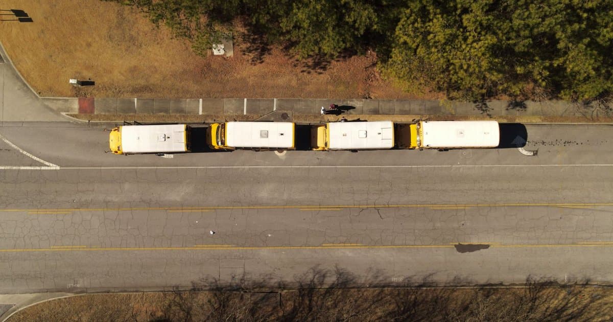
You have seen thousands of school buses, and every single one wears the same shade of yellow. It is so familiar that most people never stop to ask why. The color is not cheerful decoration and it was not left to chance. It came out of a specific meeting in 1939 and a very practical worry about safety. Before that year, buses came in all kinds of colors depending on the town. Some were red, some were white, and some were whatever paint a district could afford. That patchwork turned out to be a real problem, and one man decided to fix it.
The man was Frank Cyr, a professor who studied rural education. He noticed that children in the countryside were being hauled to school in a dangerous mix of vehicles. Some rode in trucks with benches, some in horse drawn wagons, and the buses that did exist had no shared standards at all. Cyr believed a child's ride to school should be as safe as the school itself. So in 1939 he organized a national conference to set common rules. Experts came from across the country, along with paint companies and bus makers. Over several days they hammered out standards that still shape the buses on your street.
One of the biggest questions was color. The group wanted a single shade that every district would use, which would make buses instantly recognizable and cheaper to mass produce. They lined up dozens of color samples, from pale lemon to deep orange, and studied them carefully. The goal was not beauty. The goal was to pick the color a driver's eye would catch fastest in bad light. Early mornings and late afternoons are exactly when buses are on the road and when visibility is worst. They needed a shade that would jump out in fog, gray dawn, and fading dusk.
The winner was a yellow with a hint of orange in it, later written into standards as a specific official tone. There is real science behind why it works so well. Human eyes are unusually sensitive to yellow, especially at the edges of our vision where we notice motion first. You tend to catch a flash of yellow in your side vision sooner than you would catch red. That extra fraction of a moment matters when a driver is deciding whether to slow down. The color also holds up in low light far better than darker shades. It was a choice built entirely around being seen.
There was a second reason the shade won, and it involves the lettering. Black words show up with sharp contrast against that particular yellow. The bold black letters spelling out the district and the warnings are easy to read from a distance and at speed. A driver approaching from behind can register what the vehicle is almost instantly. That pairing of bright yellow with black text was deliberate, not stylistic. It turns the whole bus into a clear signal that says slow down and pay attention. Every design detail was pointed at the same goal of protecting the kids inside.
The standard caught on quickly because it solved a shared problem. Dozens of states adopted the yellow within a few years, and the rest followed over time. Buying one standard color also drove costs down, since manufacturers could produce at scale instead of custom mixing. Over the decades the exact name of the shade changed on paper, but the color stayed essentially the same. The flashing lights and the swing out stop arm were added later to build on the same idea. All of it grew from that first decision to make the bus impossible to miss. A good safety choice tends to stick around.
What makes this story worth telling is what it reveals about the world around you. So many things that look like obvious defaults were actually careful decisions somebody argued over. The yellow bus is one of the clearest examples, because the reasoning is still visible if you know to look. It is not tradition for its own sake. It is a solved problem hiding in plain sight, repeated on millions of vehicles every school day. The same logic shows up in bright safety vests, warning signs, and emergency gear. When you want people to notice something fast, you reach for that family of colors.
So the next time a bus rolls past, you can see it for what it is. It is not just transportation painted a happy color. It is a piece of safety engineering that has protected children for generations. A professor in 1939 asked a simple question about visibility and got a lasting answer. The color choice was tested, debated, and locked in for reasons that still hold up today. That is a quiet kind of design, the sort that works so well you forget it was ever a decision. Now you know the real reason, and you will probably never look at a bus the same way.